Choosing the right color palette is one of the most effective ways to shape the look and feel of your home. The perfect color palette for your home has the power to influence mood, define space, and create a sense of balance. A well-chosen palette can make a small room feel more open or give a large space a warm, inviting touch. Before selecting colors, it is important to understand the purpose of each room and the kind of atmosphere you want to create.
Natural light, floor finishes, ceiling height, and the style of your furniture can affect how a color appears. Some tones bring calmness, while others create energy or add depth. The flow of color from one room to another should feel smooth and intentional. A strong palette supports the function of your home, enhances visual appeal, and reflects your personality through thoughtful design choices.
This blog will guide you through selecting the perfect colors for every room. We’ll cover color theory, how to match colors with your furniture and lighting, and give you tips for a space that feels beautiful and cohesive. If you’ve ever wondered how to choose the perfect color palette for your home, keep reading!
Outline
- Why Color Matters in Home Design
- The Psychological Impact of Color
- How Colors Affect Room Perspective
- Understanding the Basics of Color Theory
- The Color Wheel
- Primary, Secondary, and Tertiary Colors
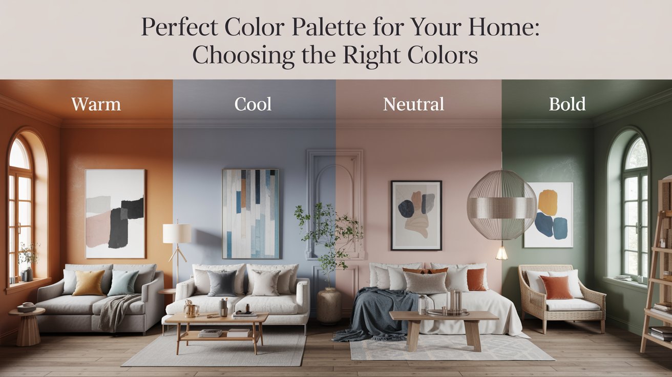
- Warm vs. Cool Colors
- How to Choose the Right Color Palette for Different Rooms
- Living Rooms and Common Areas
- Bedrooms and Relaxation Spaces
- Kitchens and Dining Rooms
- Bathrooms
- Study Room and WFH setup
- Tips for Creating a Cohesive Home Color Scheme
- Create Harmony with a Unified Palette
- Consider Natural Light and Room Size
- Mix Neutrals with Accent Colors
- Testing and Finalizing Your Palette
- Using Paint Samples and Swatches
- Let a Professional Guide Your Color Choices
- How to Adjust Your Palette as You Go
- Popular Color Palettes for 2025
- Earthy Tones and Nature-Inspired Shades
- Bold and Vibrant Colors
- Soft, Neutral Tones with Pops of Color
- Conclusion
- Finding Your Perfect Palette
- Embracing the Power of Color
1. Why Color Matters in Home Design
Color plays a powerful role in shaping the experience of any living space. It affects how a room looks, feels, and functions on a daily basis. The colors you choose can change the entire mood of your home, from lively and energetic to calm and restful. The perfect color palette for your home includes a thoughtful mix of tones that support comfort, style, and purpose. Warm shades like red, orange, and yellow can bring comfort, add warmth, and make a space feel more intimate. These tones are often used in living rooms or dining areas where people gather and connect. Cooler tones like blue, green, and soft greys help create a peaceful and relaxed environment, making them ideal for bedrooms and bathrooms.
Color also influences how we see space. Light shades can open up a room and make it appear larger, while darker colors add depth and make spaces feel more grounded. A well-thought-out color scheme brings visual flow, supports the purpose of each room, and helps create a home that feels balanced and connected.
The Psychological Impact of Color
Color has a deep connection with human emotions. It can shape how we feel the moment we enter a room. Warm tones such as red, orange, and yellow often create a sense of energy and comfort. These colors are known to increase excitement and encourage interaction, making them ideal for social spaces like living rooms, dining areas, and family zones. They help create a welcoming and cheerful environment where people feel more open and connected.
On the other side, cooler tones like blue, green, and purple bring a sense of calm and quiet. These shades are soothing to the mind and body, which makes them suitable for private spaces such as bedrooms, study corners, or reading zones. They support rest, focus, and emotional balance. The psychological effect of color works on both conscious and subconscious levels. Choosing the right tones for each room is an important part of creating the perfect color palette for your home, as it not only improves how your home looks but also enhances how it makes you feel every day.
How Colors Affect Room Perception
Color plays a key role in how we see and experience the size of a room. Lighter shades such as white, cream, beige, and soft pastels can make a space feel more open and airy. These tones reflect natural light and give the room a fresh, spacious look. They are often used in small areas where the goal is to create a sense of openness. Good air circulation further adds to this feeling, making the space more pleasant and breathable. On the other hand, darker shades like navy, deep green, or charcoal can add richness and depth. These tones bring warmth and help create a more intimate setting. They are effective in larger spaces or rooms where a cozy and enclosed feeling is preferred.
Balancing light and dark shades is essential when building the perfect color palette for your home, as it helps shape both the mood and perception of each room. However, when used in smaller rooms, dark colors can make the space feel more compact. To avoid a heavy look, it helps to balance deep colors with lighter elements in furniture, ceilings, or décor. Thoughtful use of color changes how a room feels and how people connect with it.
2. Understanding the Basics of Color Theory
Choosing the right colors for your home becomes much easier when you have a basic understanding of color theory. This concept helps explain how colors interact, how they influence mood, and how they can be combined to create balance and harmony in a space. Color theory gives you the tools to build a palette that feels connected and visually appealing.
The Color Wheel
The color wheel is a simple visual guide that shows the relationship between different colors. It is divided into three main categories: primary, secondary, and tertiary. Knowing how these groups work helps you make smart color choices for any room.
- Primary Colors: These are red, yellow, and blue. They are the base colors and cannot be made by mixing other shades. Every other color on the wheel starts from these three.
- Secondary Colors: These include green, orange, and purple. You get them by mixing two primary colors in equal parts. For example, red and yellow make orange.
- Tertiary Colors: These come from blending a primary color with a neighboring secondary color. Examples include yellow-green, red-orange, and blue-purple. They offer more variety and help you create a layered, more refined color palette.

Warm vs. Cool Colors
- Warm Colors: Warm tones include reds, oranges, and yellows. These shades bring a sense of energy and brightness. They create a lively, welcoming atmosphere and can make a space feel more active and connected. Warm colors are often used in living rooms, kitchens, and dining areas, places where people gather, talk, and share meals. They help spark conversation and make a space feel more vibrant. However, using too many bold warm tones in a small space may feel intense, so it helps to mix them with softer shades or neutral elements for balance.
- Cool Colors: Cool tones include blues, greens, and purples. These shades are known for their calming effect. They help reduce stress and create a peaceful environment. Cool colors are ideal for bedrooms, bathrooms, and quiet zones where rest and relaxation are important. They work well in areas where you want to slow down, reflect, or recharge. Lighter cool tones can make a space feel airy and open, while deeper ones add a sense of comfort and focus. Using them thoughtfully brings a sense of calm and order to the home.
3. How to Choose the Right Color Palette for Different Rooms
Every room in your home serves a different purpose, and the colors you use should reflect the mood and function of each space. A thoughtful color palette can bring harmony, support comfort, and enhance the way each room feels. Start by looking at the natural light, the size of the room, and how you want to feel when spending time there.
Living Rooms and Common Areas
The living room is one of the most used spaces in a home. It’s where people relax, entertain guests, and spend time with family. To create a welcoming and balanced atmosphere, begin with a neutral base. Shades like beige, taupe, soft grey, or off-white give the room flexibility and a clean background. To add character, bring in accent colors through cushions, art, or decor. Deep blues, forest greens, or earthy terracotta shades can add warmth and depth, making the space feel more personal.
Bedrooms and Relaxation Spaces
Bedrooms should feel peaceful and restful. Cool and gentle colors like soft blue, muted green, or lavender help lower stress and promote better sleep. These tones support a quiet, relaxing mood that suits winding down after a long day. If you prefer a more dramatic style, rich shades like navy, deep plum, or charcoal can create a cozy and elegant feel. Layering these darker tones with light fabrics and warm lighting keeps the room from feeling too heavy.
Kitchens and Dining Rooms
The kitchen is often full of activity. It’s where meals are prepared and conversations flow. To reflect this energy, use warm tones that lift the mood. Shades like golden yellow, burnt orange, or soft red can boost appetite and bring liveliness to the space. These colors pair well with neutrals like white, light grey, or natural wood finishes to keep the look balanced and fresh. In dining rooms, deeper tones like rust, olive, or brick can also work well to create a grounded and inviting setting.
Bathrooms
Bathrooms are usually smaller, so lighter tones work best for creating a sense of space. Shades like pale blue, mint green, soft beige, or classic white make the room feel clean, open, and fresh. These colors also reflect light well, which is helpful in compact areas. If you want a modern or bold style, you can add contrast with darker elements. A navy or charcoal accent wall, paired with white tiles or fixtures, gives a rich and stylish look without closing in the space.
Study Room and WFH Setup
A productive workspace needs clarity and focus. The colors you choose should help reduce distractions and support mental alertness. Soft neutrals like warm white, light grey, or beige provide a calm foundation without overstimulating the senses. To encourage concentration and energy, consider incorporating accents in shades like sage green, dusty blue, or muted teal. These tones promote calm thinking and help maintain a steady workflow. If your work involves creativity, small touches of mustard yellow or coral can add a spark of inspiration. Keep the overall palette simple and clean to support long hours of use without visual fatigue.
4. Tips for Creating a Cohesive Home Color Scheme
A well-designed home feels connected from room to room. To achieve that sense of flow, it helps to use a consistent color approach throughout the space. When colors complement each other, your home feels balanced and thoughtfully put together. Here are some simple tips to help you build a cohesive look without making it feel repetitive.
Create Harmony with a Unified Palette
Start by choosing a main color palette that can work across different rooms. A soft neutral tone like beige, ivory, or light grey is a good base, as it provides flexibility. Once this base is in place, you can introduce different accent colors in each room depending on the mood or purpose. This approach keeps the overall style connected, while still allowing variety in each space.
Consider Natural Light and Room Size
Lighting plays a big role in how a color looks. Rooms that get plenty of sunlight can carry deeper or richer tones without feeling closed in. On the other hand, smaller or darker rooms often feel more open and fresh with lighter shades. Pay attention to how natural light changes during the day in each space, and adjust your color choices to support a bright and welcoming feel.
Mix Neutrals with Accent Colors
Using neutral shades like off-white, soft grey, or warm beige as your base gives you the freedom to play with bolder colors in smaller amounts. Adding accents like deep green, mustard yellow, or rich blue in cushions, artwork, or rugs brings personality without overwhelming the room. This mix adds interest and depth while keeping the design clean and easy to live with.
5. Testing and Finalizing Your Palette
Before making any final decisions, it’s important to see how your chosen colors perform in your actual space. Colors can look very different once applied to walls, especially under changing light conditions. Testing your palette helps avoid costly mistakes and ensures that each shade feels right in your home.
Using Paint Samples and Swatches
Start by picking a few shades you like and get small paint samples. Apply them to different areas of the wall, not just one spot. Look at the colors at different times of the day, both in natural and artificial light. This gives you a clear idea of how the shade will behave in real conditions. It’s better to test first than repaint later.
Let a Professional Guide Your Color Choices
Choosing the right color palette can feel overwhelming with so many options available. An interior designer brings experience, a trained eye, and a clear understanding of how colors interact with space, light, and mood. They can guide you in selecting shades that match your vision, lifestyle, and the unique character of your home. A designer also helps avoid costly mistakes, ensuring that every room feels cohesive and thoughtfully styled. Their expertise can turn your ideas into a polished and personalized design plan with lasting appeal.
How to Adjust Your Palette as You Go
Sometimes a color that looks great on a swatch may feel too bright or dull once it’s on the wall. That’s a normal part of the process. Don’t hesitate to change a shade or switch an accent color if it doesn’t feel right. The goal is to create a space that feels comfortable, natural, and aligned with your personal style. Small adjustments can make a big difference in the final result.
6. Popular Color Palettes for 2025
The color trends for 2025 reflect a strong connection to comfort, creativity, and nature. This year’s palettes offer a balance between grounded, earthy tones and bold, expressive colors. The focus is on creating interiors that feel personal, calm, and inspiring. Whether you’re planning a full makeover or just updating a few rooms, these trending color combinations can help guide your choices and inspire the perfect color palette for your home.
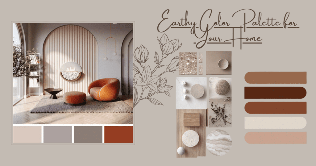
- Earthy Tones and Nature-Inspired Shades: Colors drawn from nature continue to lead the way in 2025. Warm terracotta, muted clay, olive green, and soft brown tones create a sense of calm and stability. These shades work well in living rooms, bedrooms, and reading corners where you want a grounded and welcoming atmosphere. They pair beautifully with natural materials like wood, stone, and linen.
- Bold and Vibrant Colors: Rich, deep hues are making a strong return. Think emerald green, sapphire blue, and deep plum. These jewel tones add drama and elegance, especially when used for accent walls, upholstery, or feature pieces. They can instantly bring life to a neutral space and are ideal for those who want a touch of luxury and personality in their interiors.
- Soft, Neutral Tones with Pops of Color: Classic neutrals remain a popular choice for their flexibility and timeless look. Shades like warm beige, light grey, and off-white create a clean, calm background. To keep the space from feeling too plain, these tones are paired with vibrant accents such as mustard yellow, cobalt blue, or burnt orange. This approach allows you to update the look over time by simply changing accessories or decor, without redoing the entire palette.
7. Conclusion
Choosing the perfect color palette for your home is more than just picking shades that look good. It’s about creating spaces that reflect your personality, support your lifestyle, and make you feel at ease every day. The right colors can change the mood of a room, improve its function, and connect the entire home with a sense of flow and balance. Understanding basic color theory, recognizing the emotional impact of warm and cool tones, and considering factors like lighting and room size help you make informed decisions. Testing shades in real conditions and making small adjustments along the way allows your space to grow with your vision. Whether you’re designing one room or planning a full transformation, a thoughtful color strategy brings clarity, comfort, and beauty to your home.